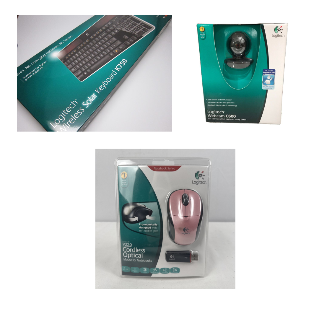
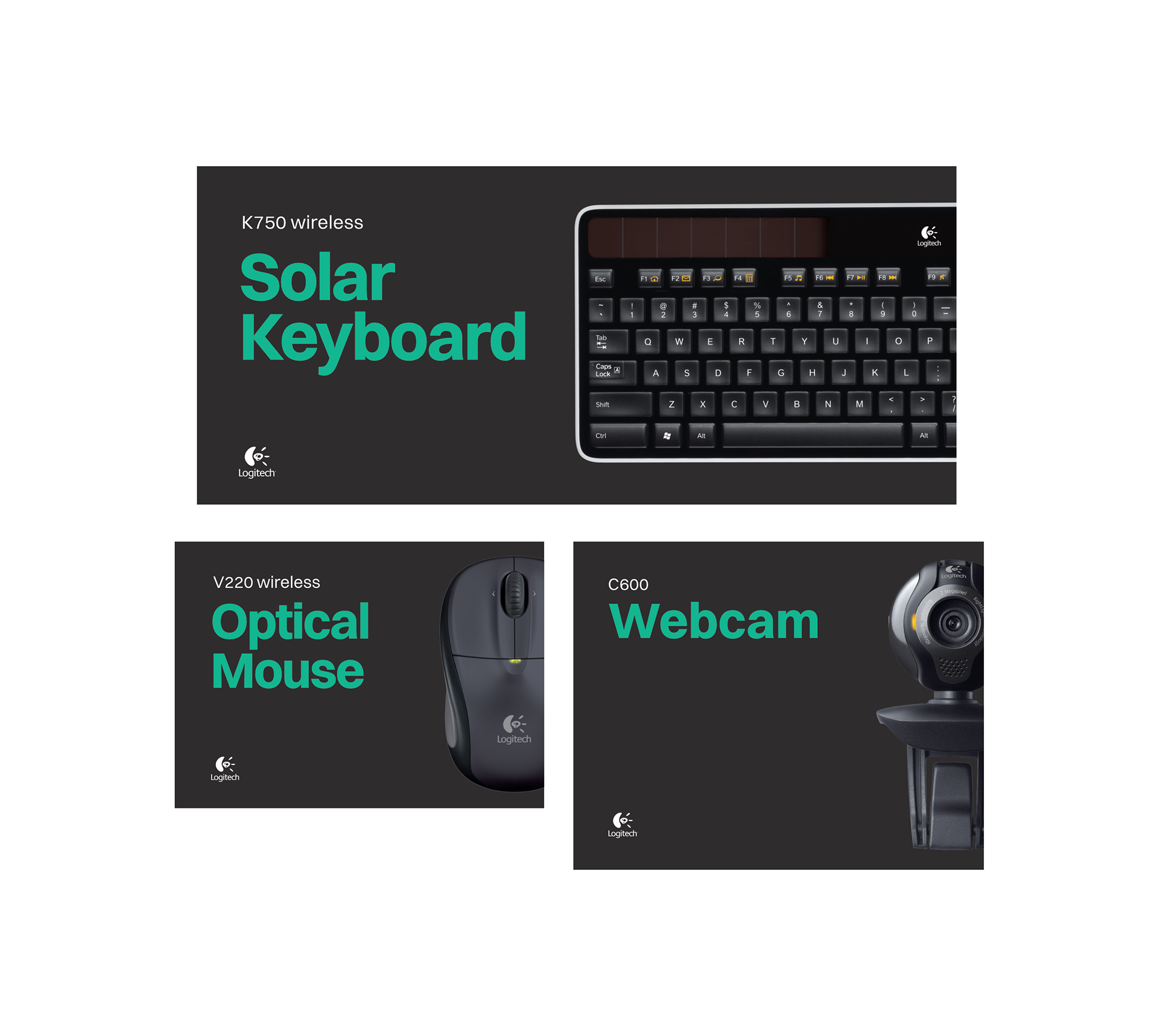
Logitech Packaging redesign concepts ca. 2010. This new direction was intended to stand out against a competitive field full of marketing slogans and cluttered typography. Clean bold product names and dynamic hero photography help create an eye catching shelf presence. In addition, the design concepts focused on shifting much of the existing packaging away from relying on plastic as much as possible, which was not a common practice at the time.
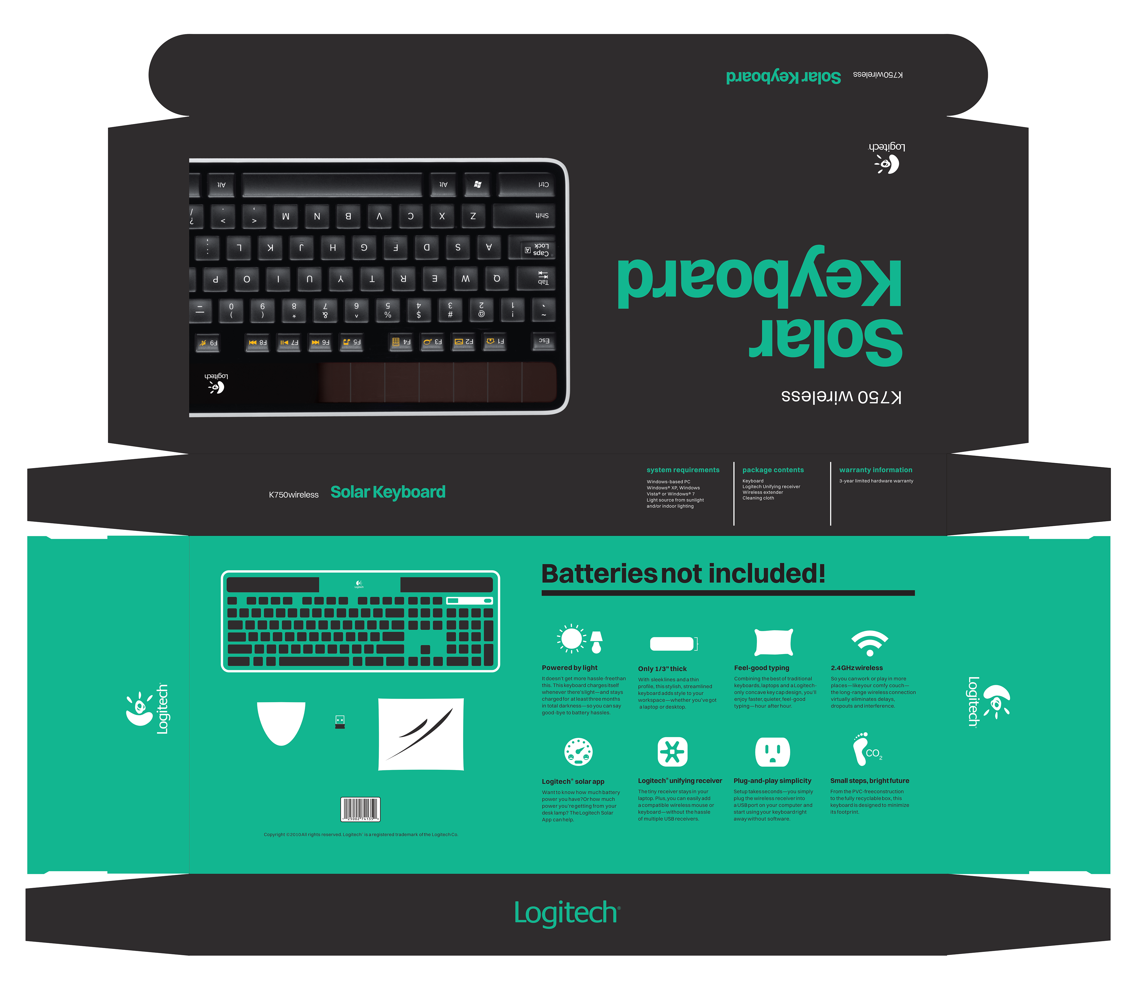
Example of full design laid out in a dieline.