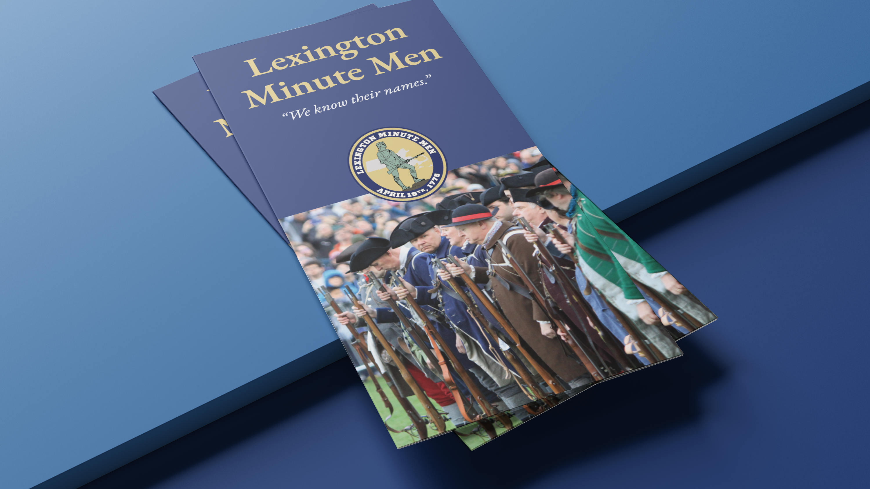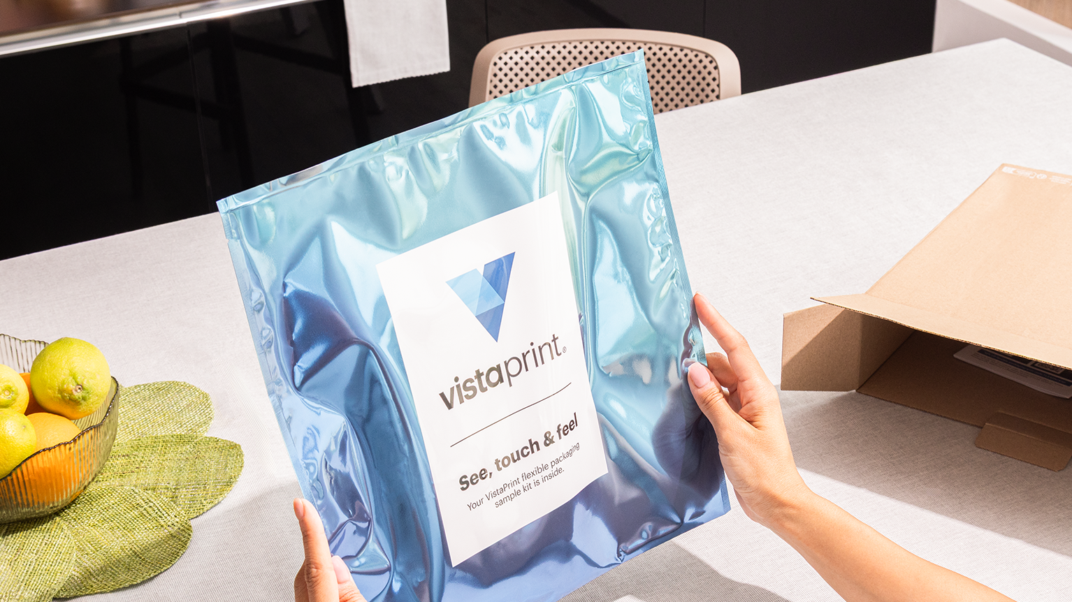
This is a small campaign I created for a new customer offer. At the time our overall brand expression utilized bold shapes and a rich candy-like color palette. This type of work was often more a typographic exorcize than anything else.

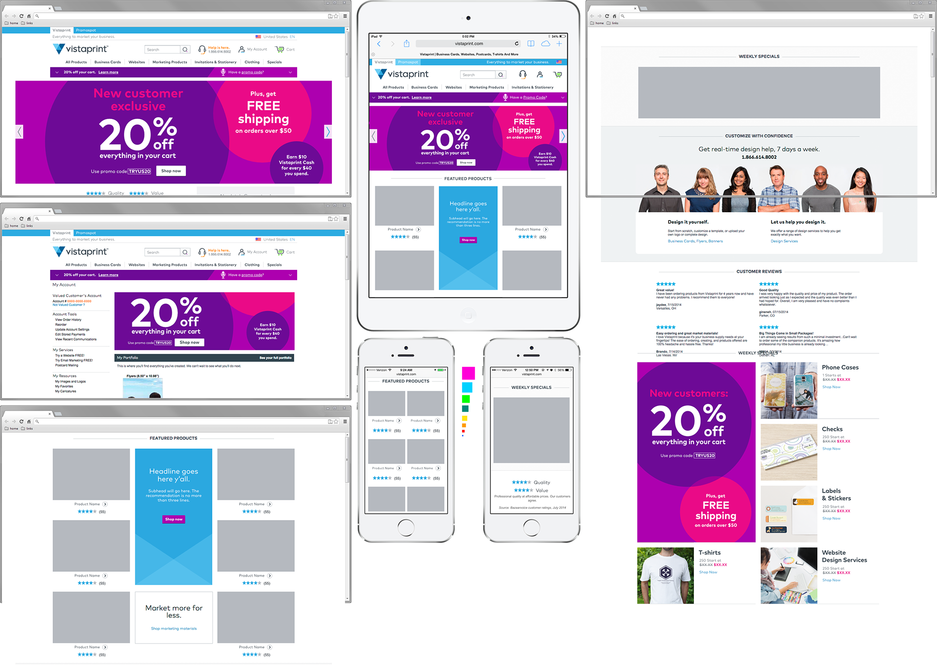
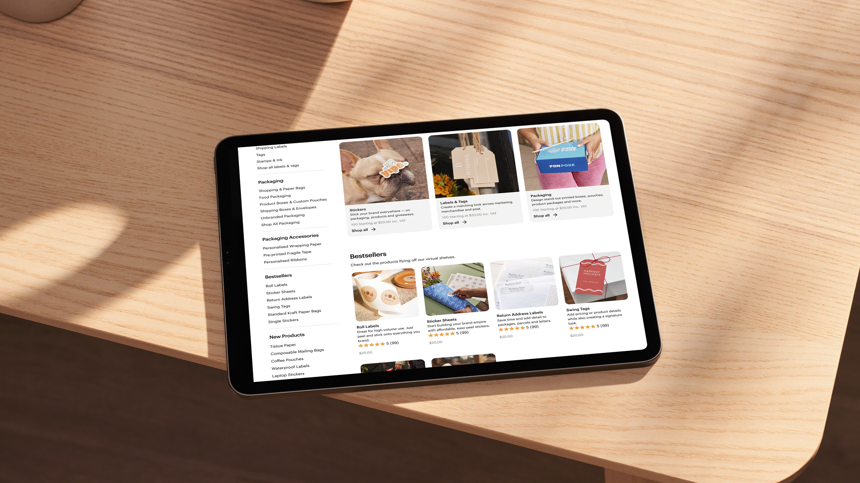
At the time we would create these diagrams to show all the different placements across the site. This was later replaced with Figma.