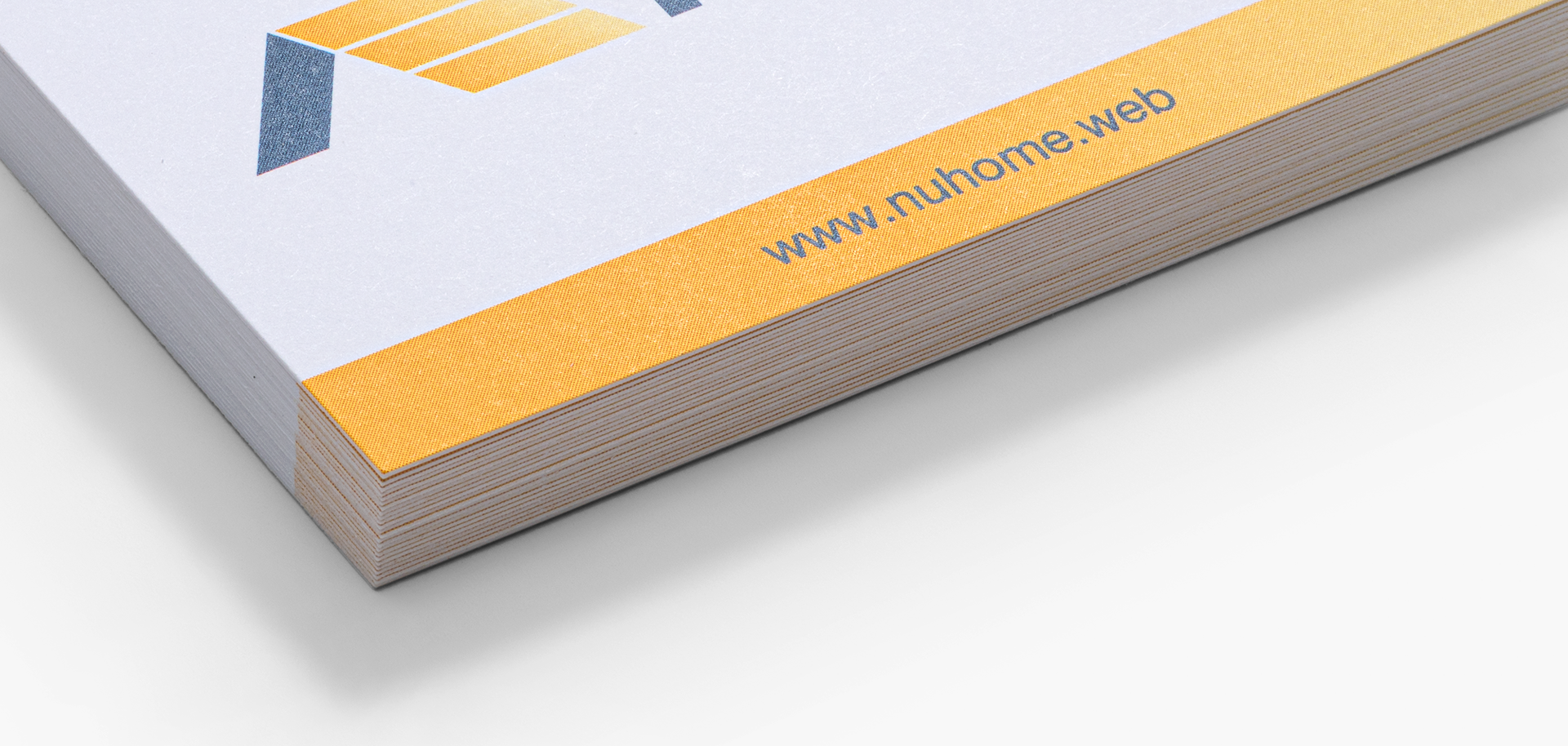
The Challenge
How can we translate the differences in our many paper stock options to customers so they have a better idea of what their design will look like on it?


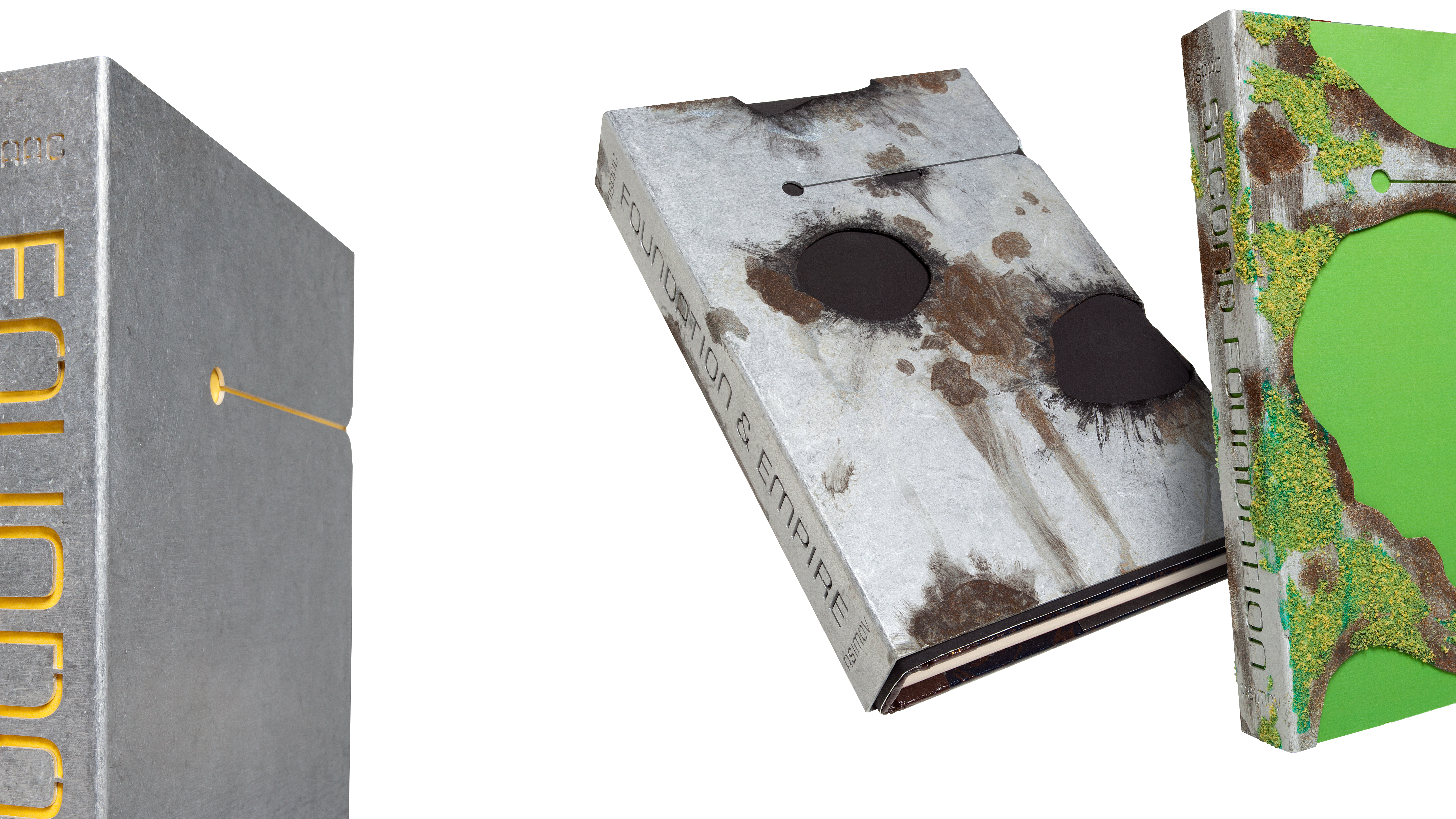
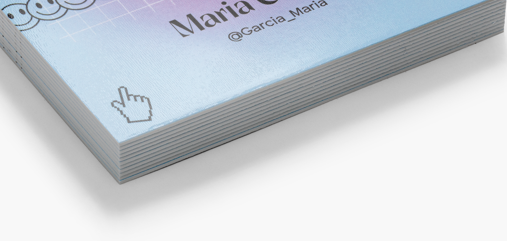
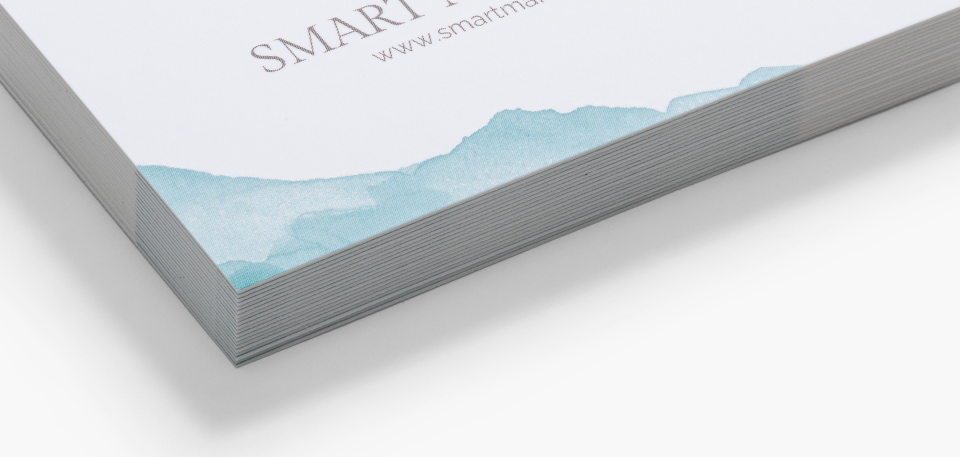
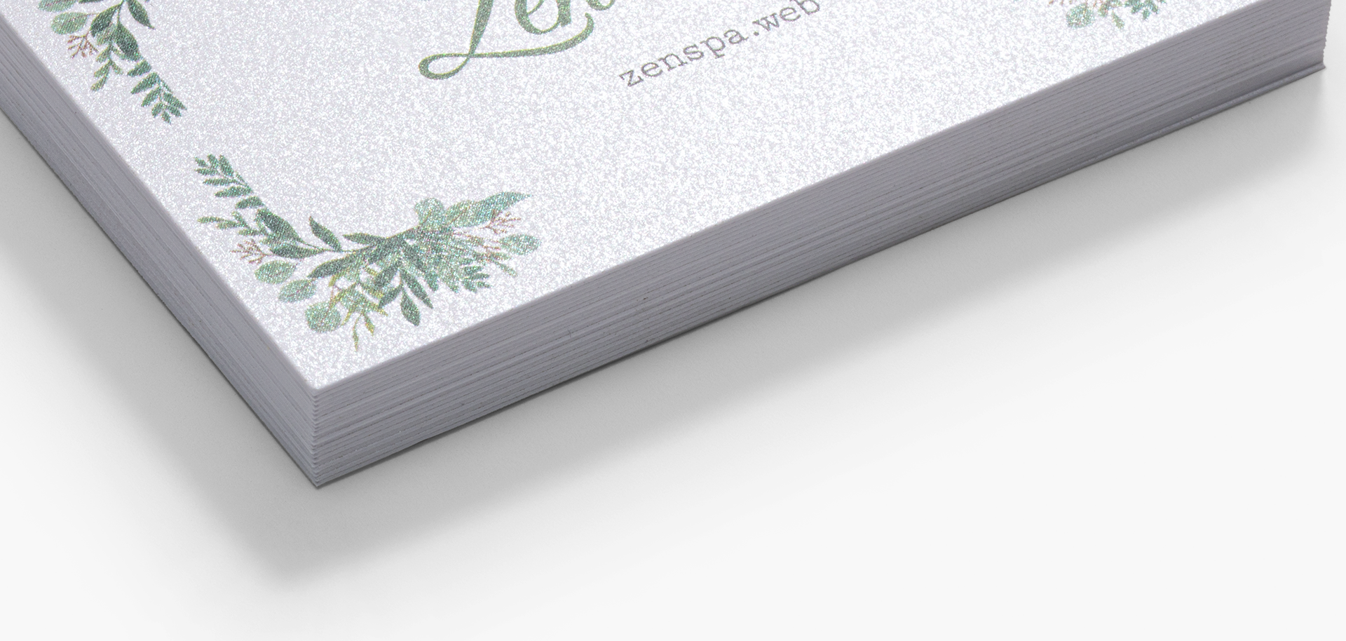
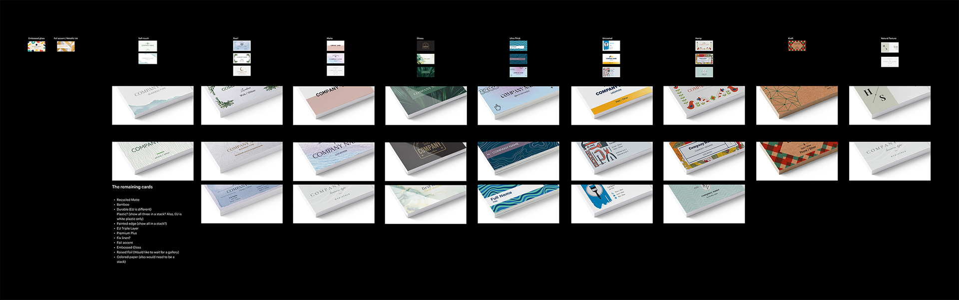
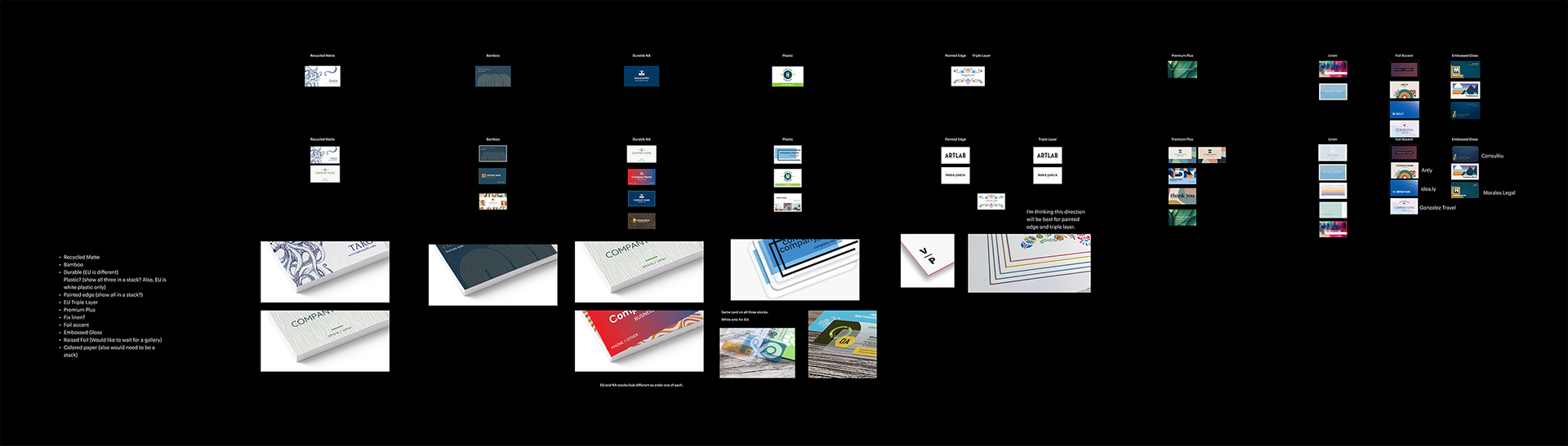
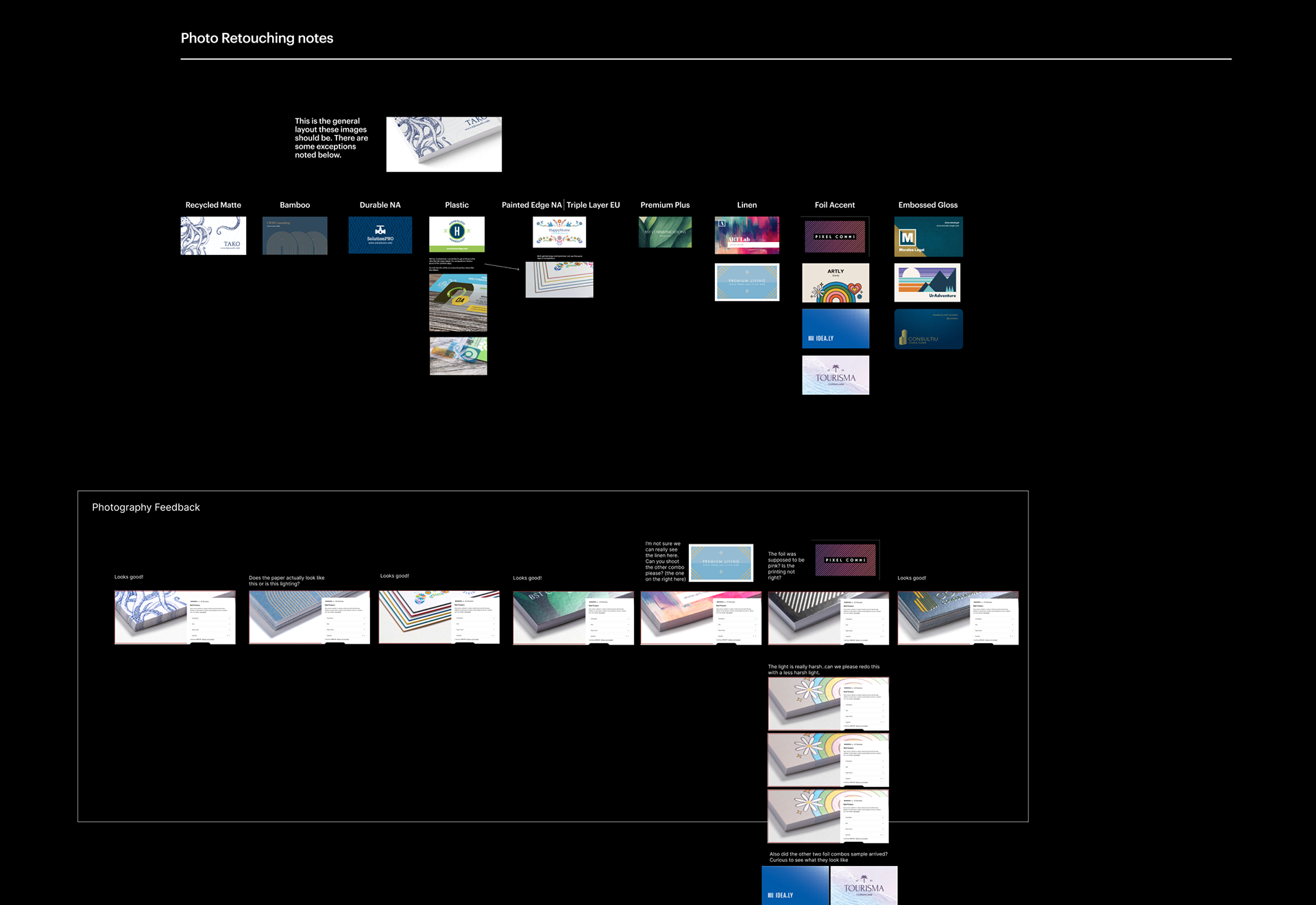
Examples of different methods for showing paper stock textures that we tried. This helped us pinpoint the exact style customers found to be the most helpful.
Our Approach
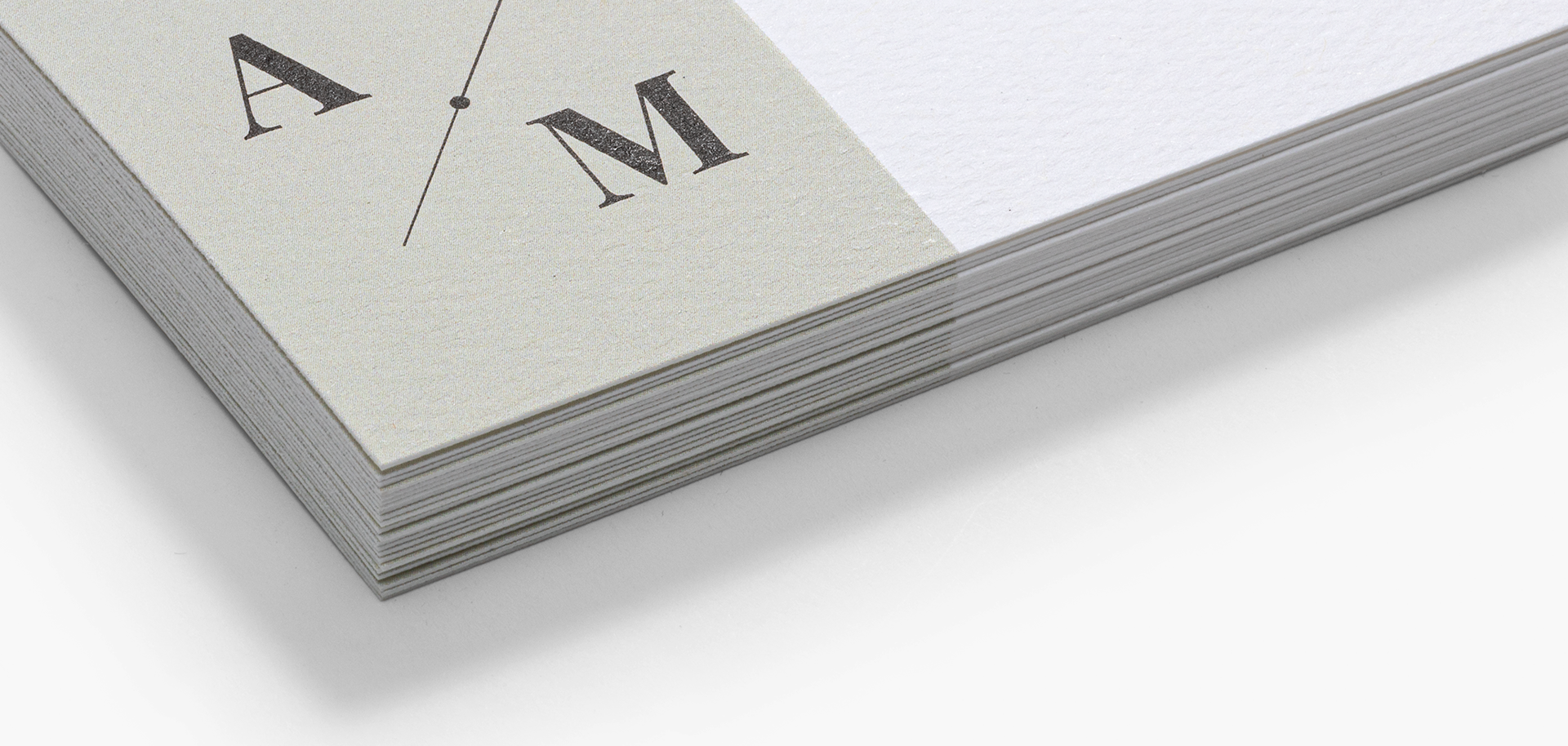
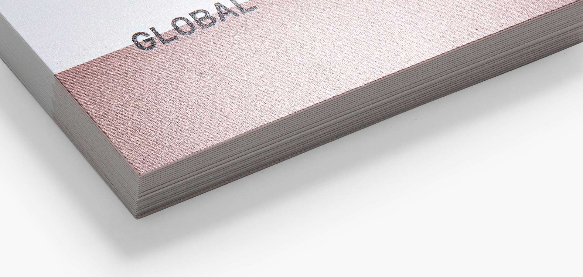
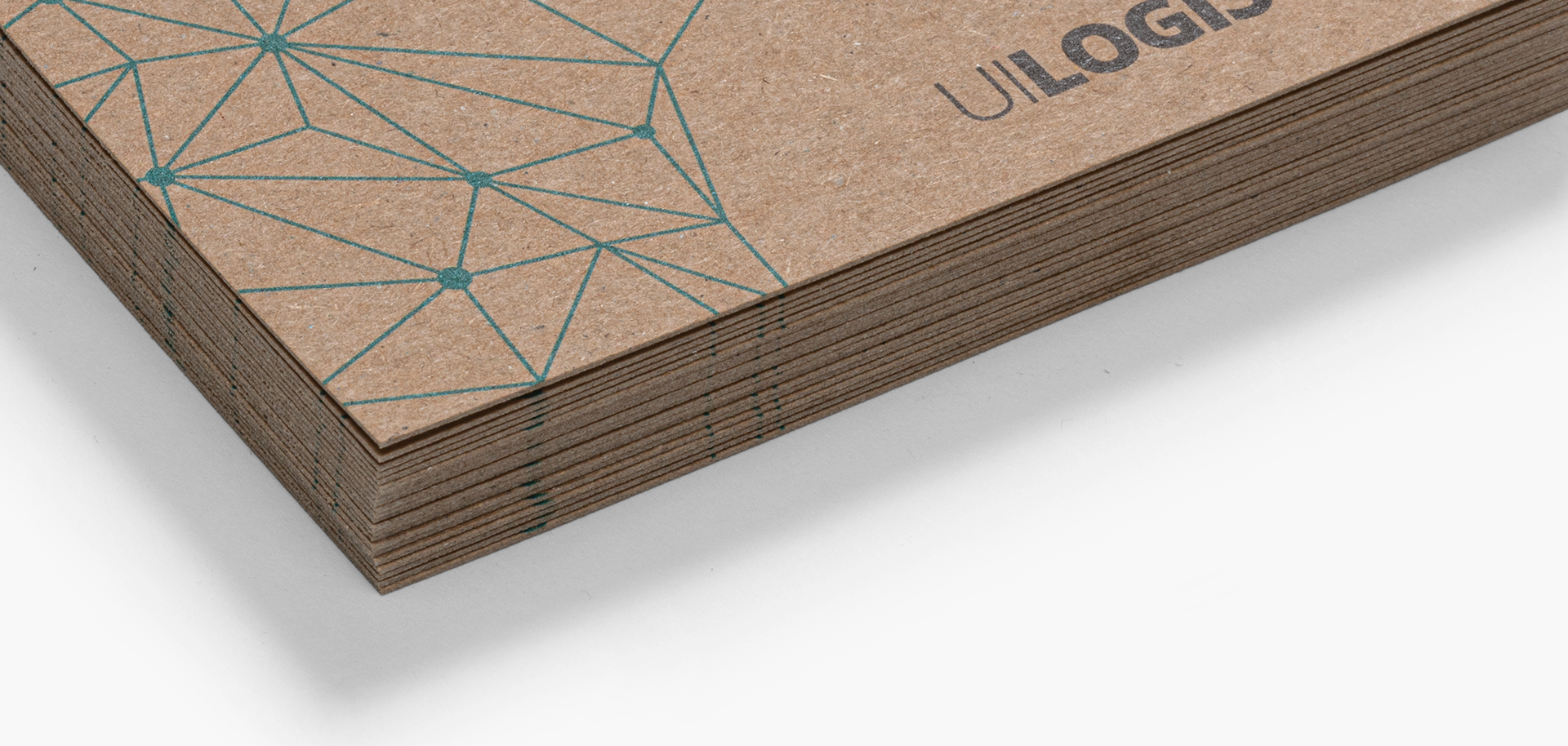
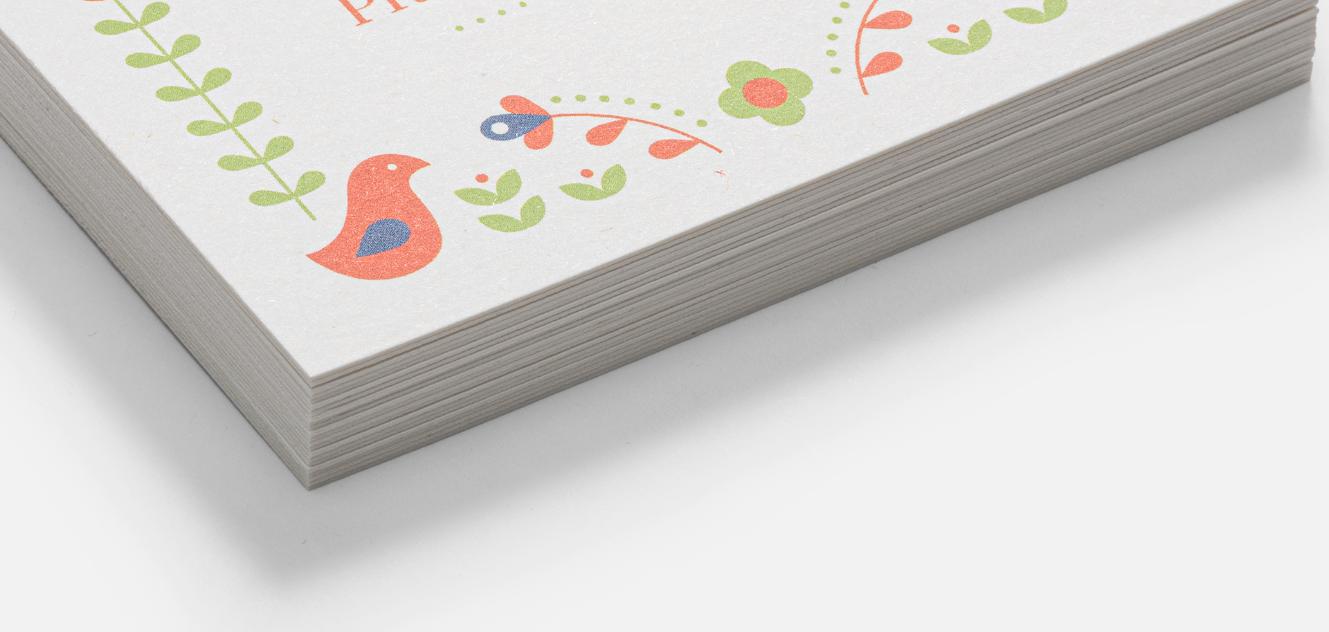
This project was self initiated after many customer interview sessions for other projects where customers would often be surprised by a paper stock after seeing and feeling it in person. Up to this point many of our paper stocks looked the same based on how we photographed them at the time. I wanted to develop a new way to show these differences that are often subtle and textural in a way that was both beautiful and informative.
As project lead I was able to present my concept and gain buy-in from Product Strategy, I then lead a cross-functional team of photographer, and production artists to see this project from concept to final delivery.
The Outcome
By meticulously planning and executing this visual strategy, we were able to provide customers with an unparalleled visual understanding of their paper choices. This initiative directly addressed the initial challenge, building customer confidence and enhancing the overall user experience on our product pages.
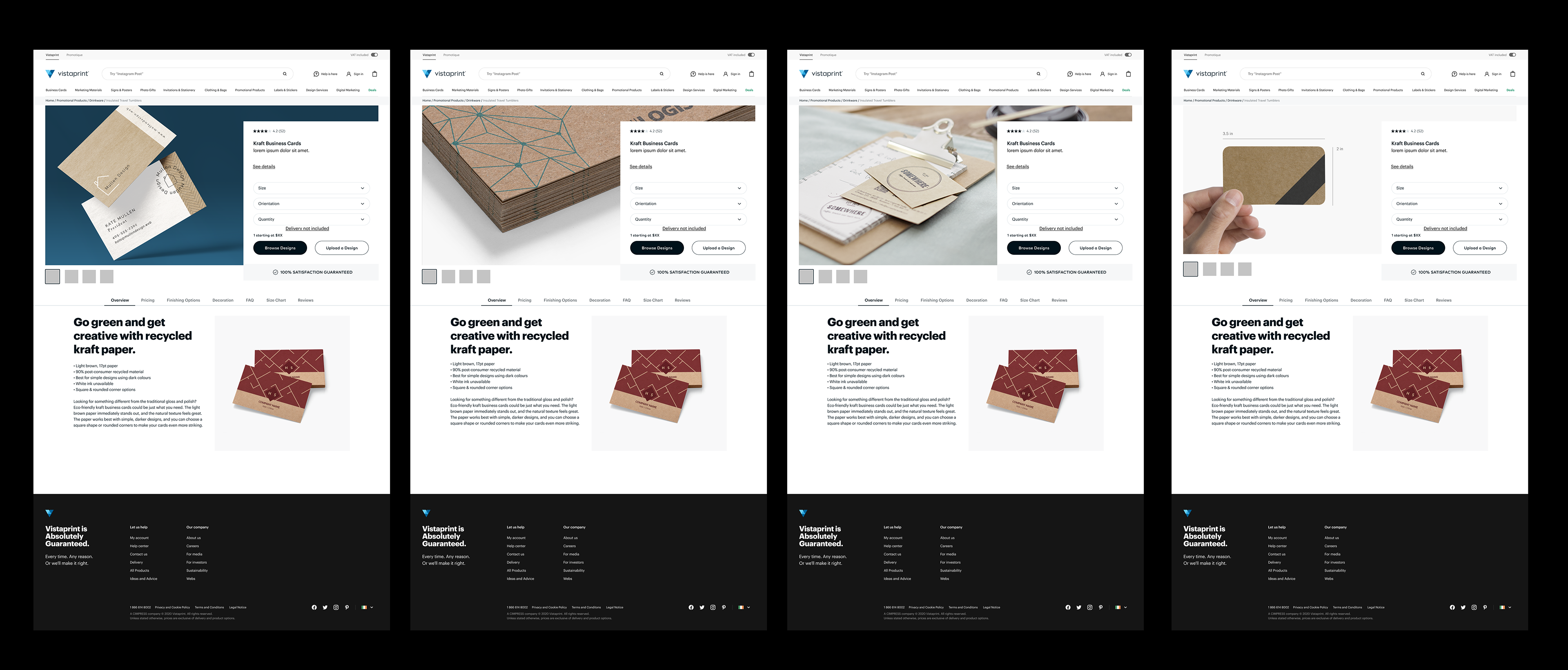
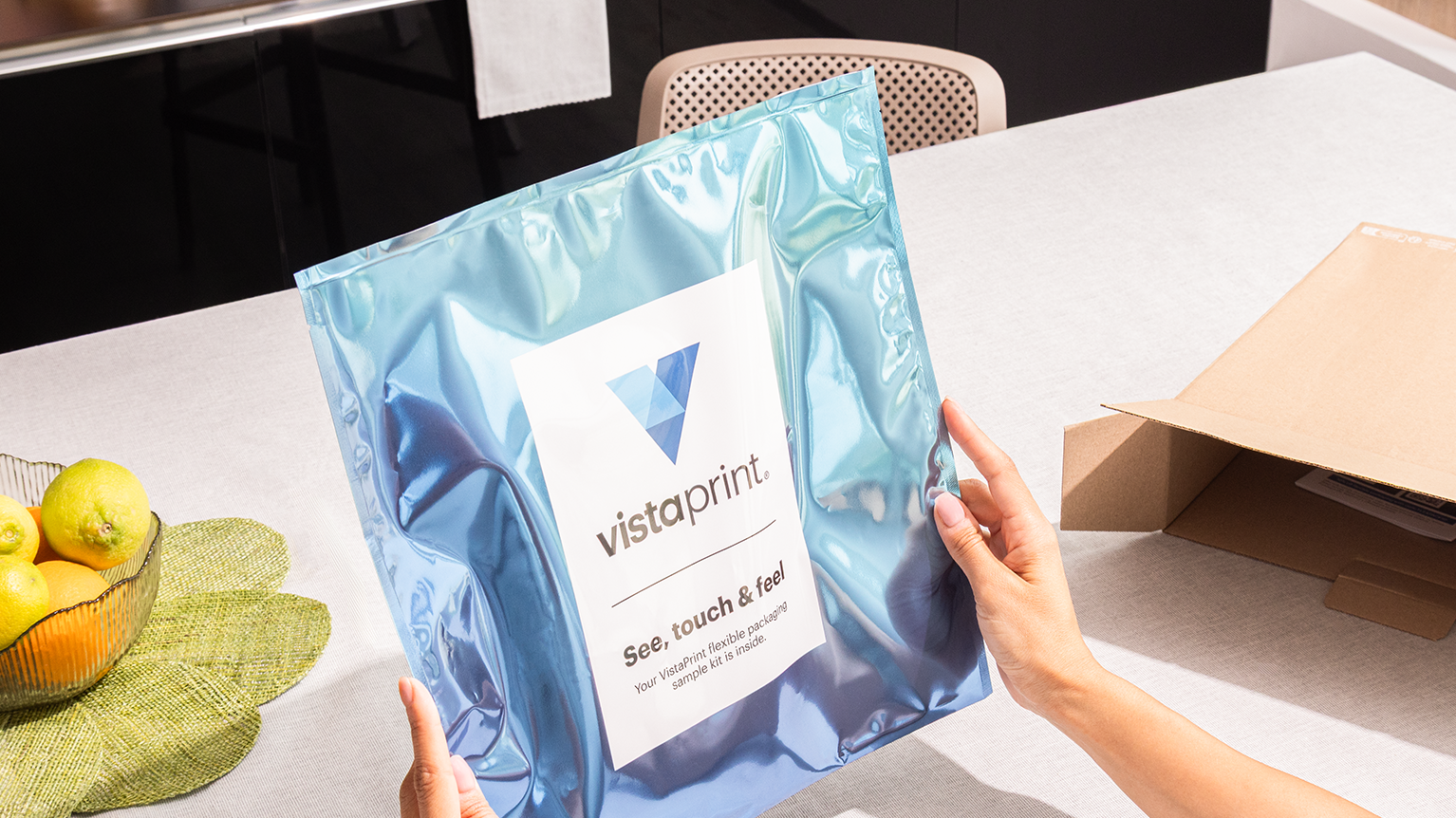
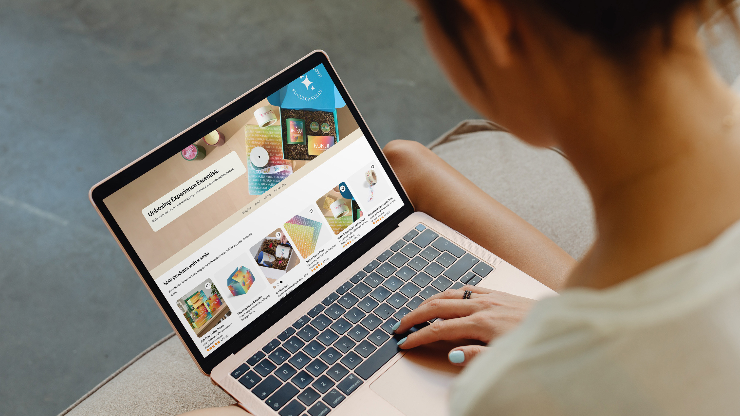
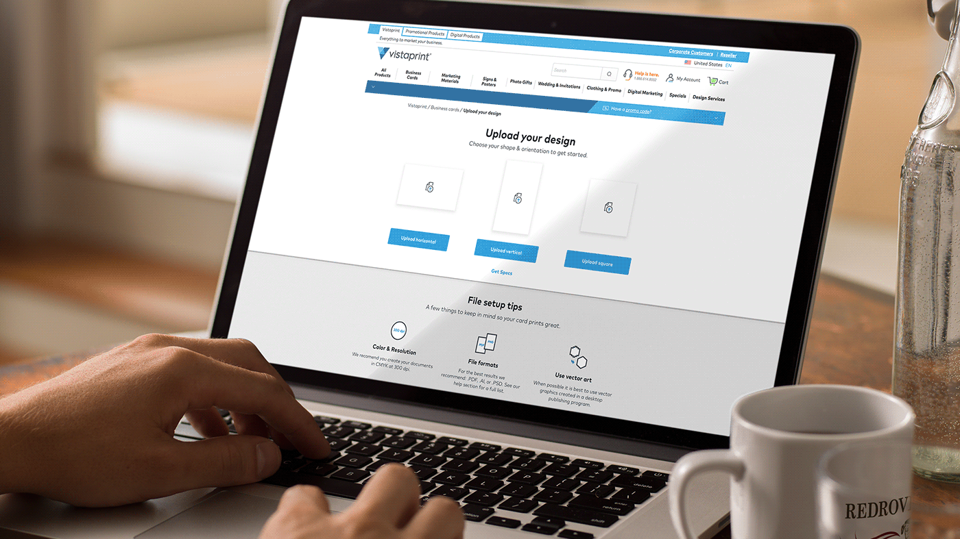
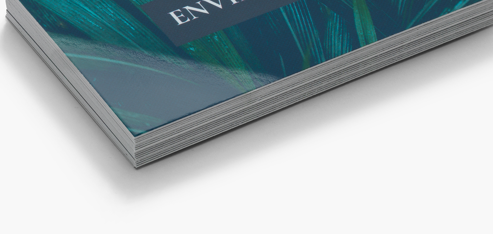
This is an example of a finished image being used on a product page to help flesh out the story.