The Challenge
Vistaprint's expanding business card offerings, while providing customers with greater choice, inadvertently introduced significant complexity to the standard configurator page. The sheer volume of intricate and often ambiguous options presented a substantial usability challenge for customers, leading to confusion and potential selection errors.
Testing
I collaborated with product strategy to interview customers about their experience creating and ordering business cards. This uncovered several issues with the current product page.
Text-Based Paper Choices: Paper options were presented as plain text, lacking any visual cues or descriptive information.
Disjointed Paper Type and Weight Selection: The separation of paper type and paper weight selectors frequently led to customers making incompatible selections, resulting in frustration and rework.
Lack of Visual and Descriptive Information: Customers unfamiliar with printing terminology struggled to make informed decisions due to the absence of visual representations or clear descriptions of different paper stocks.
These issues highlighted a critical need to enhance the clarity and intuitiveness of the business card customization process, empowering customers to confidently make selections.
Solution
Our strategic hypothesis was that enhanced organization and visual representation would significantly improve customer comprehension of the available options. To address the identified challenges, we implemented a multi-faceted approach:
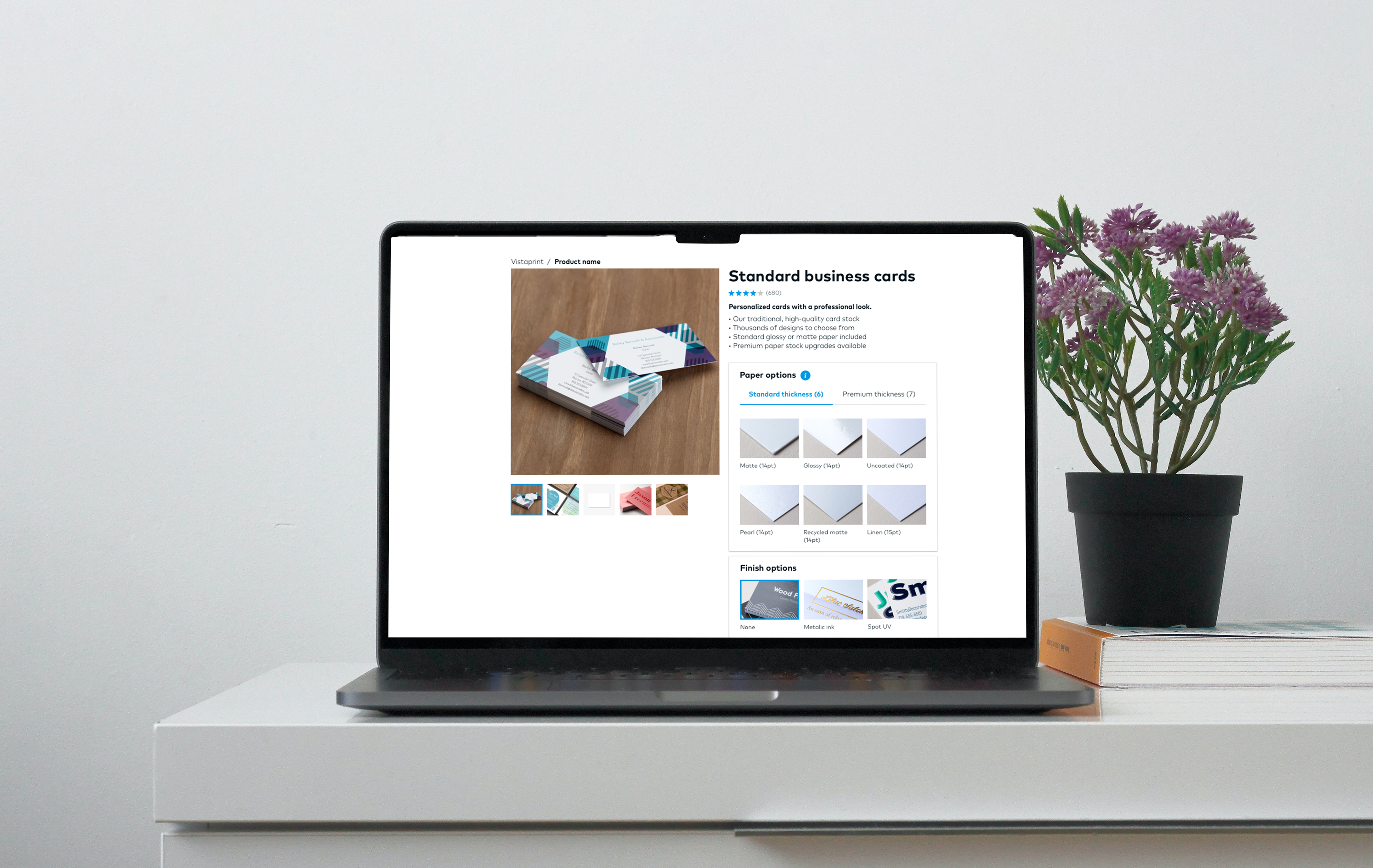
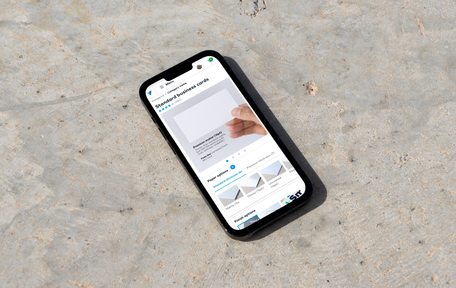
Tabbed Organization for Paper Stocks: We reorganized standard and premium paper stocks into a tabbed component. This provided customers with a clear, segmented view of available papers within each distinct category, making it easier to explore options relevant to their needs.
Visual Representation of Paper Choices: We replaced the ambiguous text-based selectors with visual representations of each paper stock. This offered customers immediate and intuitive references for their choices, allowing them to quickly grasp the look and feel of different paper types without prior knowledge.
Impact
Through an iterative testing process with customers, we continuously refined this solution, validating its effectiveness and making necessary adjustments based on user feedback. The implementation of these design changes yielded significant positive outcomes:
Reduced Selection Errors: The clear organization and visual cues drastically reduced the number of incompatible or incorrect paper selections made by customers.
Increased Adoption of New Paper Stocks: By simplifying the understanding of diverse paper options, we observed a significant increase in the adoption of newly introduced paper stocks beyond the traditional matte and glossy finishes. This not only provided customers with more choice but also helped them discover new possibilities for their business cards.
This case study demonstrates how strategic reorganization and intuitive visual design can effectively de-complicate complex product configurators, leading to a more positive user experience and tangible business benefits.

