The Challenge
With a vast array of options available at launch, it was clear that customers would have a hard time wrapping their heads around ordering a custom Real Estate Sign. Additionally certain options would not be compatible with others, thus making the chances for error very high.
We needed to come up with a way to minimize this friction while still giving the customer easy access to all the options available.

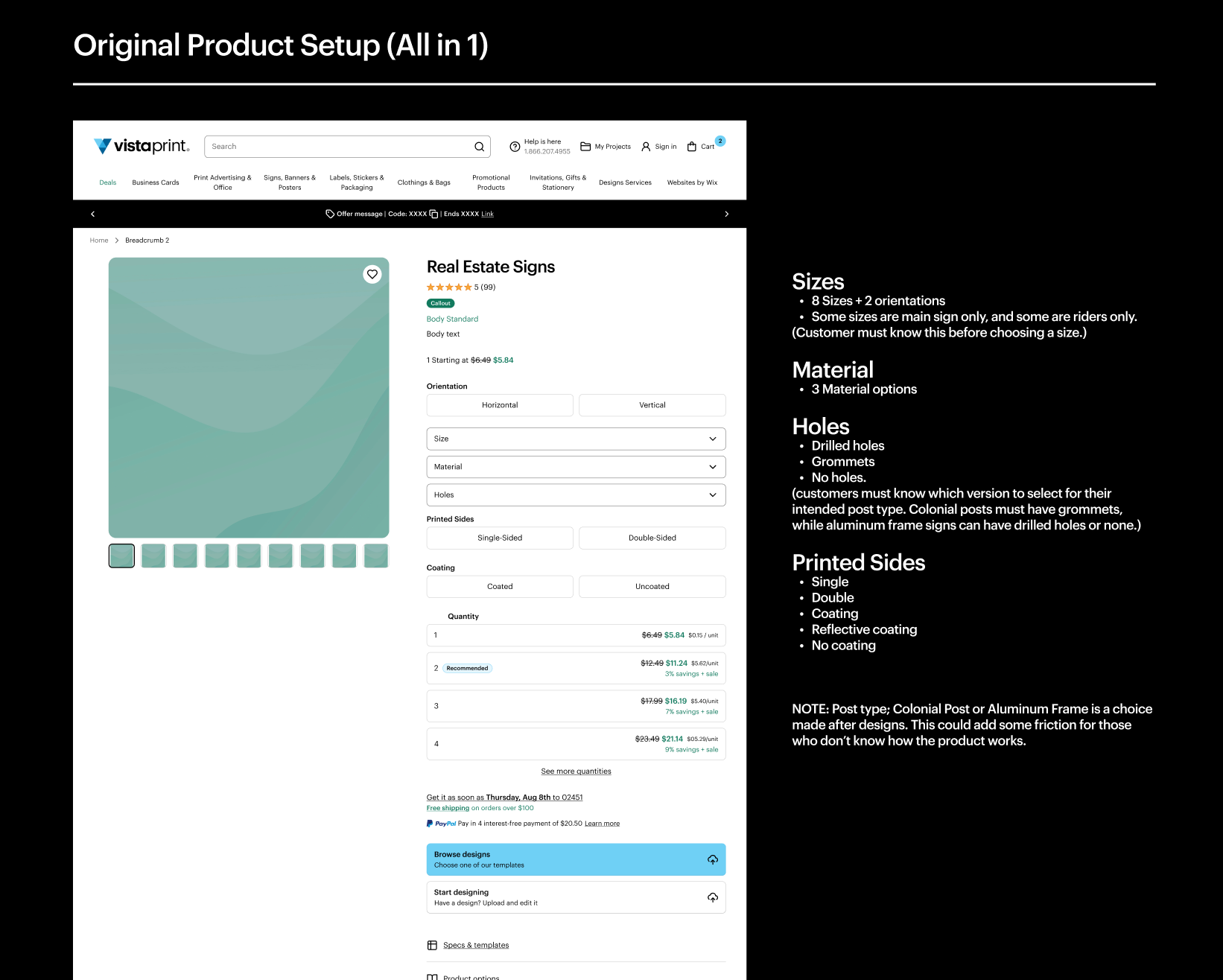
In the original setup the two places where customers experience the most friction was in choosing the size, and the hole options, as there were many options, and some might be incompatible with the separate frame option chosen later.
Testing
We initially launched the product as an MVP while closely watching conversion rate and customer care call volume. These early days lent some credence to our initial hypothesis, and warranted a deeper dive into how the product was set up.
To gain a deeper understanding of customer needs and pain points, I collaborated with the product strategy lead, and UX copy to uncover where the specific pain points of the ordering process might actually be. Here is what we found:
Information Overload: Customers struggled with the sheer volume of choices and the technical specifications associated with each option.
Aversion to Text-Heavy Education: While extensive information was available on the page, users generally avoided reading through it to educate themselves on the various components and their implications.
Need for Intuitive Guidance: Users expressed a strong desire for a more intuitive and less demanding way to understand their options and make informed decisions.
These insights highlighted a clear need for a more integrated and user-friendly educational approach that seamlessly guided customers through the selection process without relying on dense textual explanations.
Strategic Solution
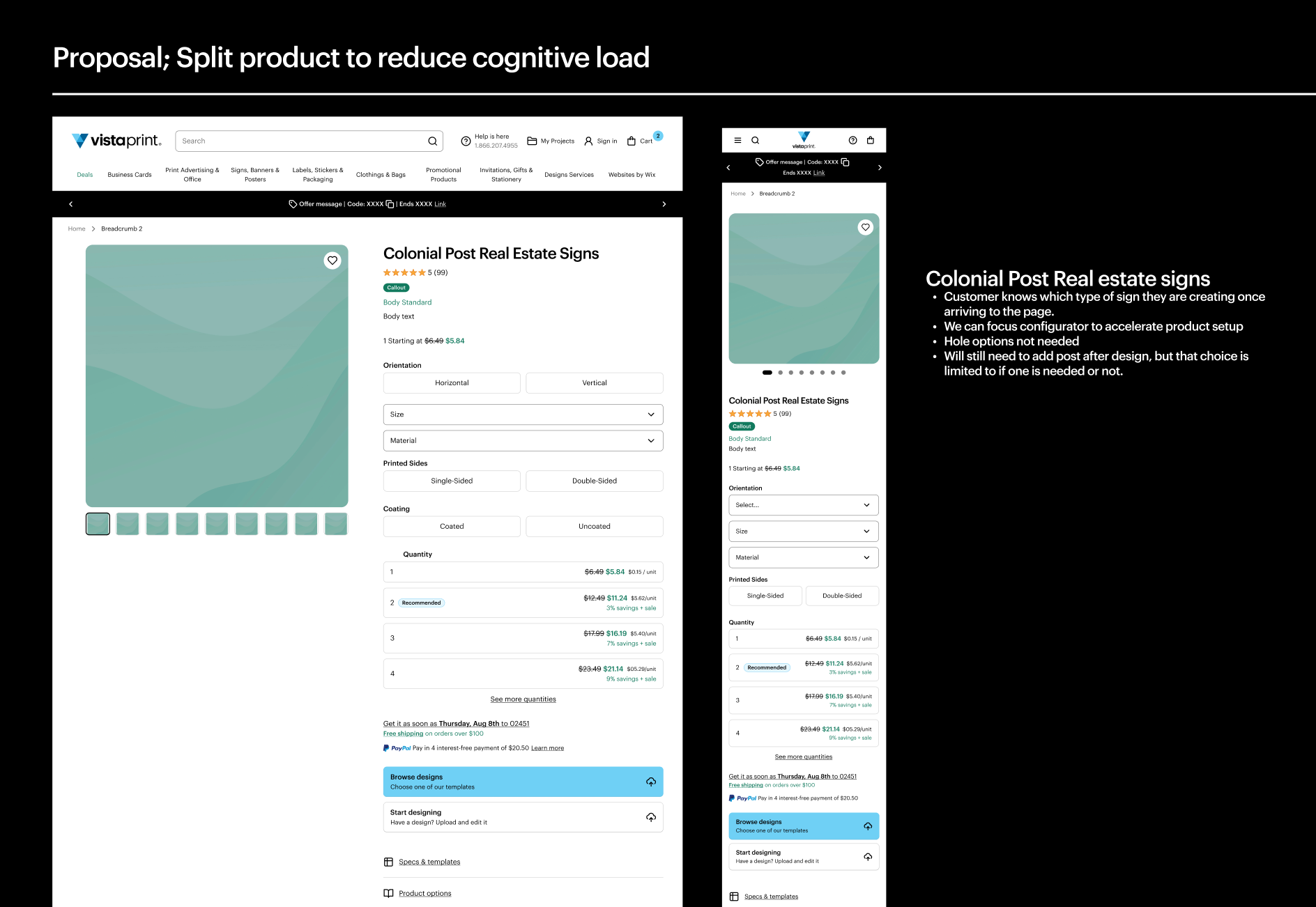
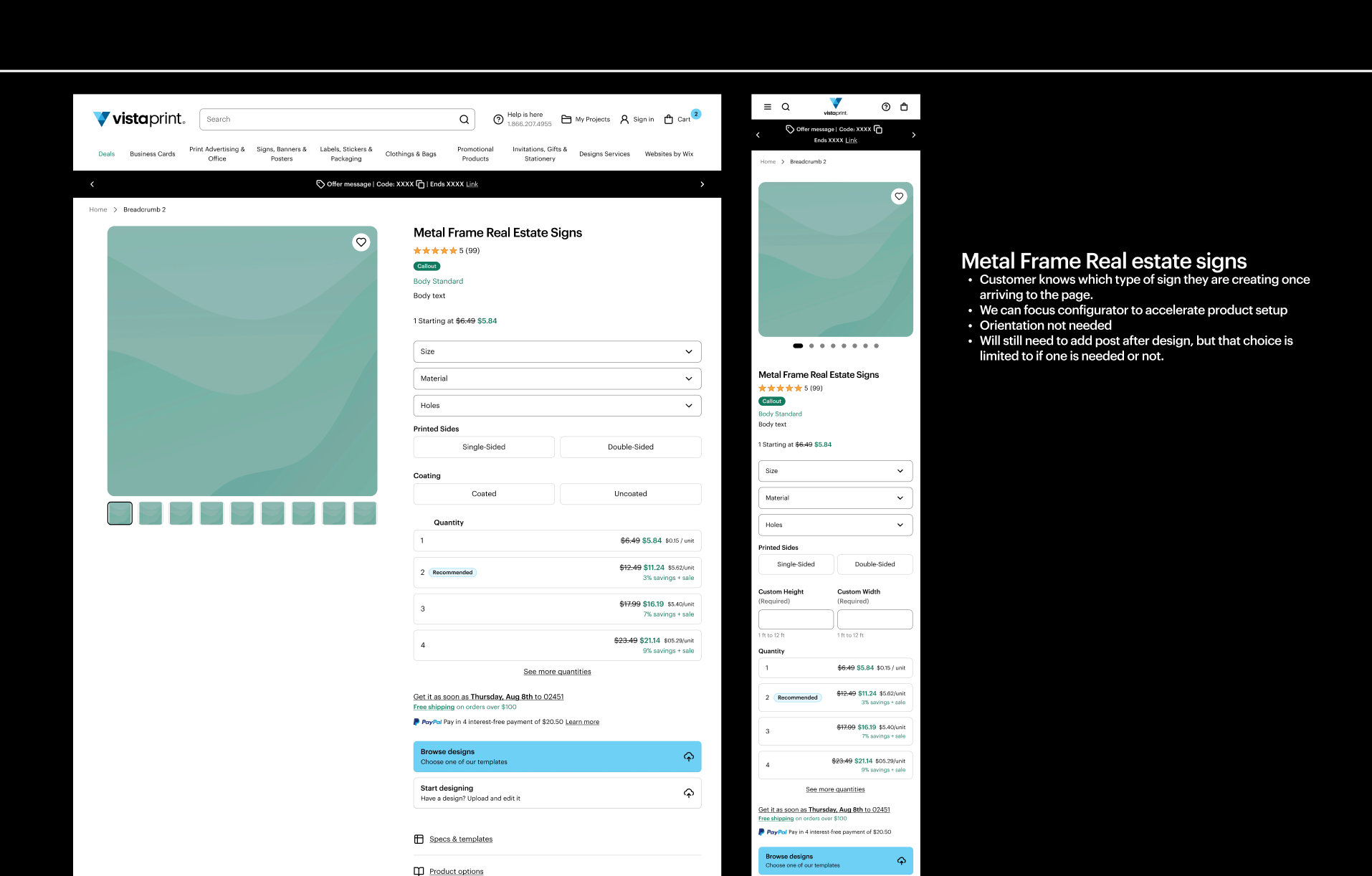
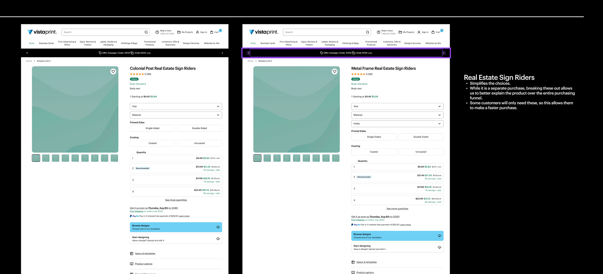
To address the issue experienced by customers we decided to split the single product into four simpler products. This meant we could eliminate a lot of the potential errors by pushing certain choices that were at the end of the funnel to the start.
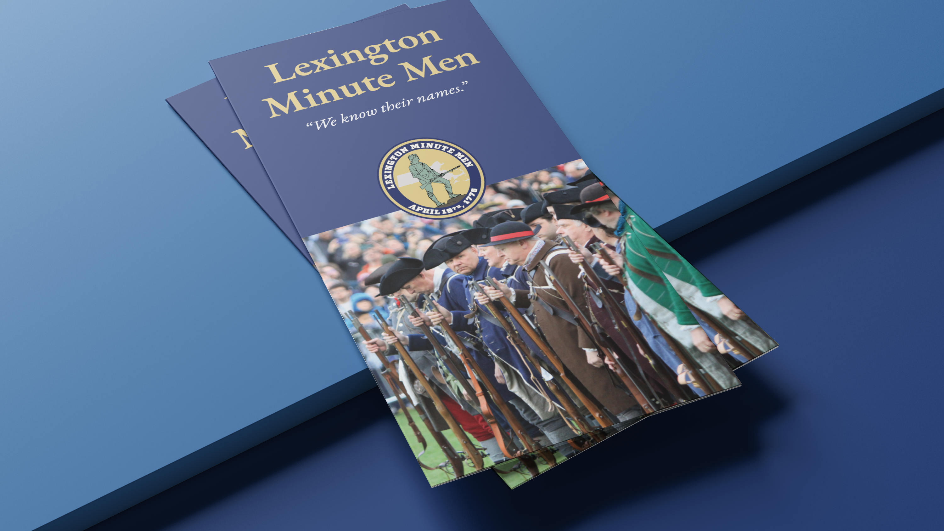
Colonial Post Signs: This category caters to the most common perception of real estate signs, offering a streamlined experience for customers seeking this traditional style.
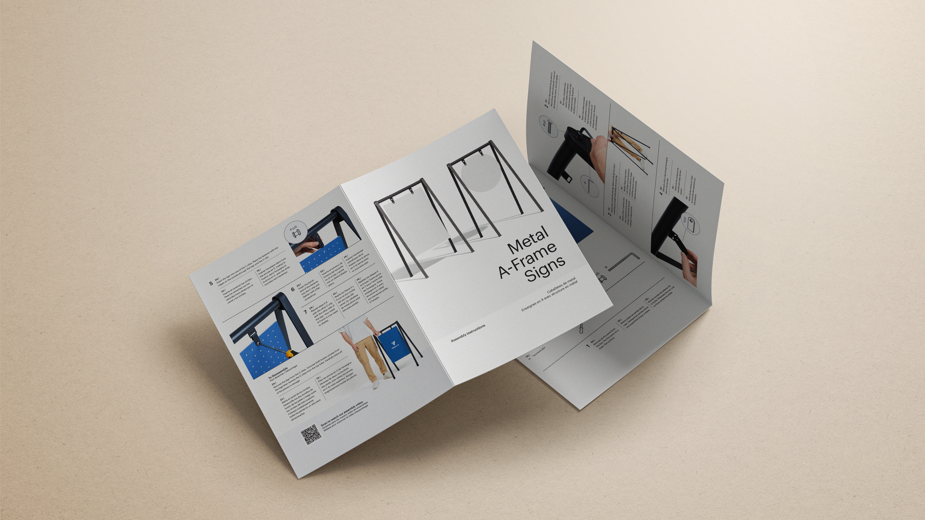
Metal Frame Signs: A dedicated page for metal frame options provides a clear and distinct path for customers with this specific need.
Rider Signs: These are the small signs you can add to the top or bottom of the main sign, and needed to be split based on how they attach to each frame type.
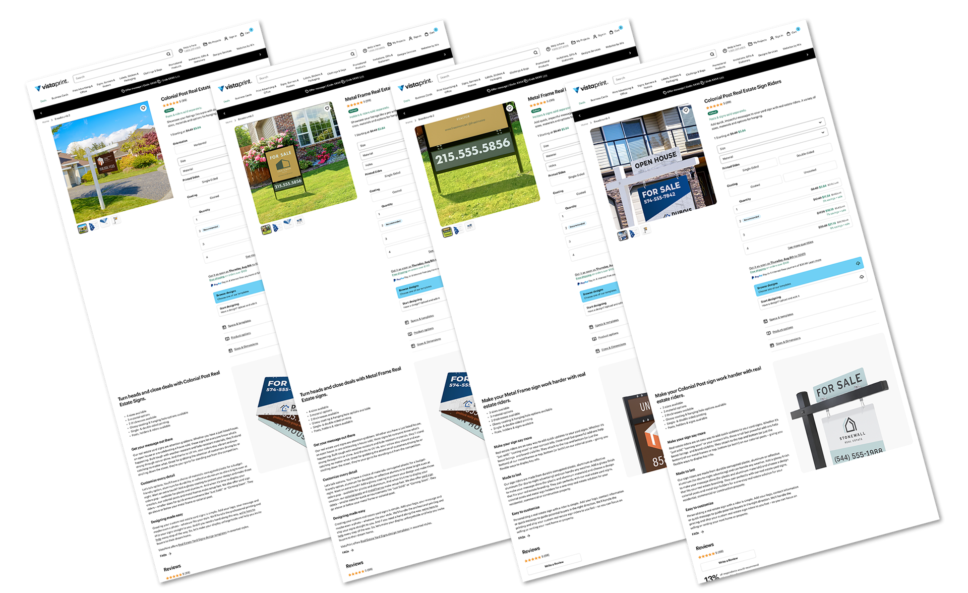
Figma Desktop mockups built with our product page template.
Art Direction
In addition to developing a launch strategy for Real Estate Signs, I was also responsible for the creation of all image assets from concept to final delivery, managing a cross functional team of photography, 3D artists, and production artists.


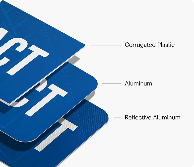
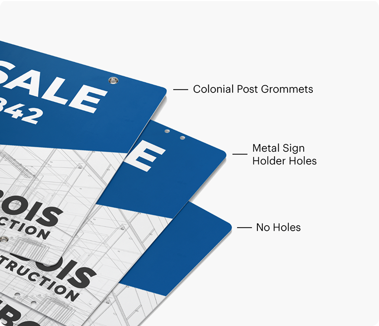
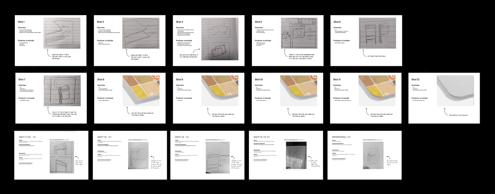
Shot list / photo brief created as reference for our international photography team to understand what would be needed to launch Real Estate Signs on the site.
Impact
This strategic shift allowed us to spread the cognitive load of all the choices into more of a decision funnel, rather than being dumped on a single page, and having to figure it all out at once. This refined strategy aimed to empower customers to confidently select the right sign mix for their needs, ultimately leading to a more efficient and satisfying purchasing journey.
As a result, care calls due to order issues has been reduced, and corresponding customer satisfaction is on the rise.